Case 01
Boost Sales by 30% with Simplified Navigation
RV Trader-B2C

Boost Sales by 30% with Simplified Navigation
Project Overview
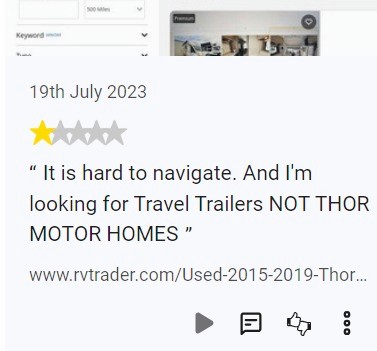
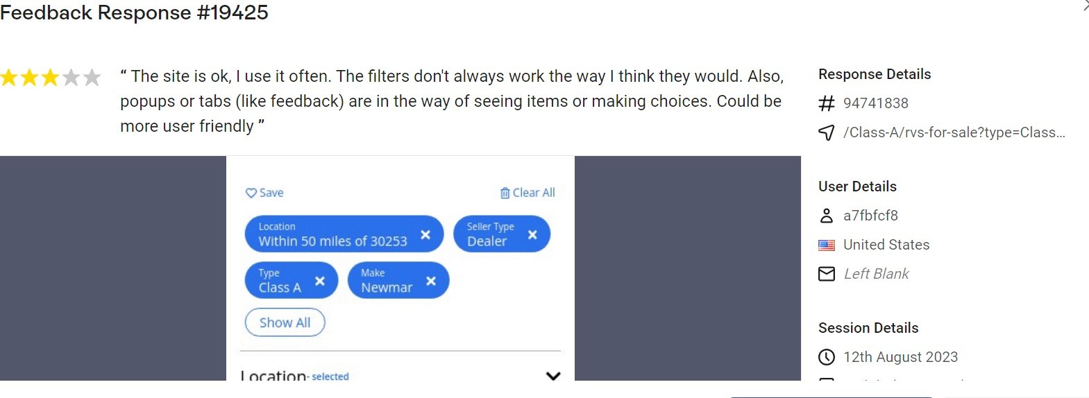
After discussing with the product manager, I learned that users were leaving negative reviews on the app stores and downloads were low, impacting revenue. This made it clear we needed to find effective solutions.
Problem Statement
Frustrated by a cluttered UI, confusing errors, and mobile-unfriendly design, users abandoned tasks midway and left negative reviews, damaging the app’s reputation and growth
Industry
RV Trader-B2C
My Role
UX Designer
Platforms
Android and IOS
Timeline
January 2024- March 2024
Process
Persona

Jhon Roberts
Marketing Manager
I just want the contacting seller to be quick and painless—no surprises or unnecessary steps!
Age: 29
Location: New York City
Tech Proficiency: Moderate
Gender: Male
Goal
Quickly complete purchases without interruptions.
Trust the platform to handle payments securely.
Seamless mobile experience for purchasing RV.
Frustrations
Long and confusing RV listings.
No option available to change location.
Poor mobile optimization that slows down.
UX Audit
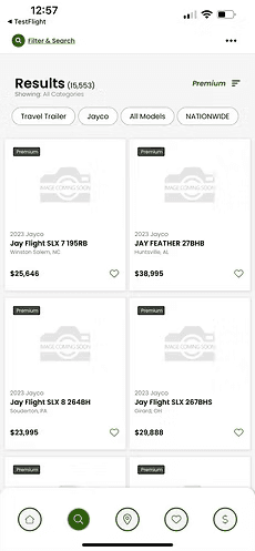


filter option
isn't visible,
search isn't
prominent
Cards are
constantly changing
even without any search
Sorted Reviews

Pain Points
No personalization or choices shown on the homepage
No content or inspiration to help users explore options.
Listing cards are too small — key info gets lost.
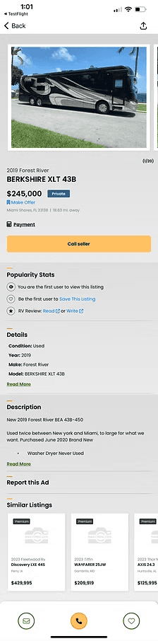
VDP (Vehicle Detail Page) lacks structure.
App Flow
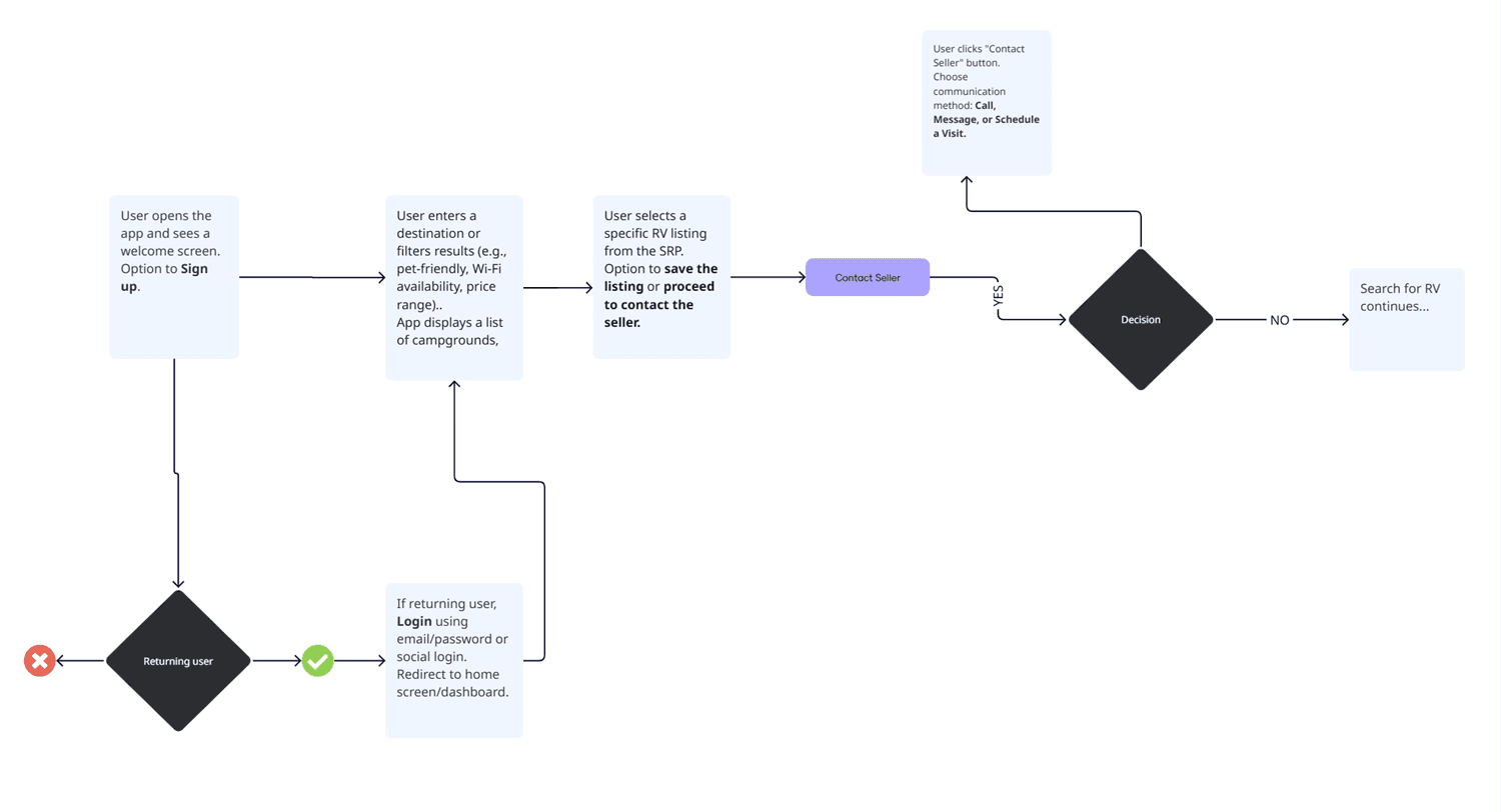
Iterate & Iterate

Homepage
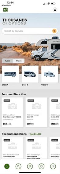
Before
After


Search Result Page

Filter and search
are clearer and
more convenient.
Now we have
location icon.
Cards are bigger
now, improving
readability and
ease of interaction
Before
After
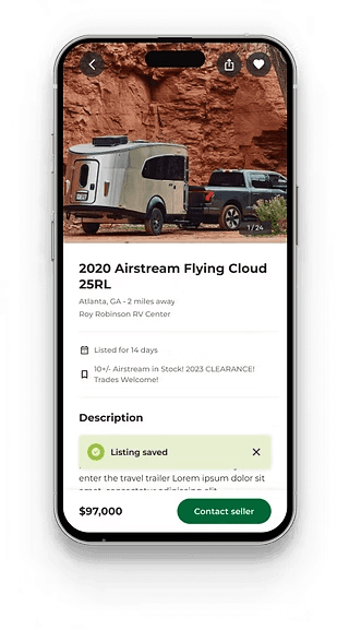
Vehicle Description Page
Contact seller
button and price
are sticky.
Before
After
Description is
mentioned
just below
the name of the RV
Usability Testing
Metrics
Achieved a 25% increase in users contacting dealers.
30% increase in app downloads, reflecting improved user interest and engagement.
45% improvement in perceived ease of use, based on post-launch survey results
Key Learnings