Case 02
25% Increase in Conversion Rate.
Boatmart B2B-B2C
Boatmart is a website where boat
dealers post boats for sale,..
...and people anywhere in
U.S. and Canada can buy boats.
..and people anywhere in U.S.
and Canada can buy boats.
Boatmart is a website where boat
dealers post boats for sale,..
...and people anywhere in
U.S. and Canada can buy boats.
..and people anywhere in U.S.
and Canada can buy boats.

Boatmart is a website where
boat dealers post boats for sale,..
Boatmart is a website where
boat dealers post boats for sale,..
..and people anywhere
in U.S. and Canada
can buy boats.
..and people anywhere in U.S.
and Canada can buy boats.
Boatmart is a website where
boat dealers post boats for sale,..
Boatmart is a website where
boat dealers post boats for sale,..
..and people anywhere
in U.S. and Canada
can buy boats.
..and people anywhere in U.S.
and Canada can buy boats.
25% Increase in Conversion Rate After Introducing Improved Filter Functionality and Homepage.
Boosting Conversion Rates
Project Overview
The product manager highlighted that rising bounce rates, caused by poor user experience, were affecting revenue goals — leading to in-depth research and a complete website redesign.
Problem Statement
Users visiting Boatmart struggle with cluttered navigation, ineffective search filters, and unclear listings, making it difficult to find and purchase boats. The confusing seller contact process and delayed responses further frustrate users, leading to negative reviews, declining engagement, and lost sales.
Industry
[Trading]
My Role
Lead Designer
Platforms
Web and Mobile
Timeline
June 2023- Sep 2023
Process
[01] User Research
Conducted a UX audit to identify areas for improvement using a heuristic approach.
Conducted user interviews to understand the pain points, and gather insights.
Gathered insights from user interviews and conducted a competitive analysis.
[01] User Research
Conducted a UX audit to identify areas for improvement using a heuristic approach.
Conducted user interviews to understand the pain points, and gather insights.
Gathered insights from user interviews and conducted a competitive analysis.
[01] User Research
Conducted a UX audit to identify areas for improvement using a heuristic approach.
Conducted user interviews to understand the pain points, and gather insights.
Gathered insights from user interviews and conducted a competitive analysis.
[02] Insights
Users reported difficulty navigating, as no proper info to direct them.
Many users noticed missing details about boats and dealerships, especially on VDP.
Users found suggestions helpful, but the overall experience feels incomplete.
[02] Insights
Users reported difficulty navigating, as no proper info to direct them.
Many users noticed missing details about boats and dealerships, especially on VDP.
Users found suggestions helpful, but the overall experience feels incomplete.
[02] Insights
Users reported difficulty navigating, as no proper info to direct them.
Many users noticed missing details about boats and dealerships, especially on VDP.
Users found suggestions helpful, but the overall experience feels incomplete.
[03] Design Solution
Redesigned Boatmart with simplified navigation and powerful search filters, to make boat shopping effortless.
Streamlined seller contact with easier forms and real-time chat options.
Mobile-optimized design for a smoother experience on all devices and Improved information hierarchy on product page.
[04] Testing & Iteration
Tested mobile responsiveness to ensure a smooth experience across devices.
Addressed pain points like unclear listings and slow seller responses through multiple design rounds.
Refined wireframes and prototypes based on user insights. Ran A/B tests on key features like filters and contact forms.
UX Audit
I started with UX audit to uncover pain points impacting engagement and conversion. Leading to actionable insights
for simplifying and improving the experience.
I started with UX audit to uncover pain points impacting engagement and
conversion. Leading to actionable insights for simplifying and
improving the experience.
I started with UX audit to uncover pain
points impacting engagement and
conversion. Leading to actionable
insights for simplifying and improving
the experience.
globes aren't visible
because of the blue
background
filters are limited;
need to be more sorted
for effortless experience

globes aren't visible
because of the blue
background
filters are limited;
need to be more sorted
for effortless experience
filters are limited;
need to be more sorted
for effortless experience
user who already
subscribe shouldn't be
seeing suscription
section between
the listings.
globes aren't visible
because of the blue
background
user who already
subscribe shouldn't
be seeing suscription
section between
the listings.
user who already
subscribe shouldn't
be seeing suscription
section between
the listings.
globes aren't visible
because of the blue
background
showing just featured
listing, limiting user search
showing just featured
listing, limiting user search
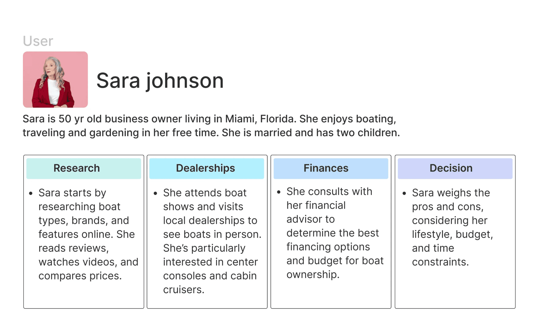
User Interviews
To gain real user insights, I conducted interviews with 2 users who have previously bought and sold boats. While
the sample size was small due to availability, their experiences provided valuable qualitative input on pain points,
expectations, and decision-making behaviors during the boat buying/selling journey.
To gain real user insights, I conducted interviews with 2 users who have previously
bought and sold boats. While the sample size was small due to availability, their
experiences provided valuable qualitative input on pain points, expectations, and
decision-making behaviors during the boat buying/selling journey.
To gain real user insights, I conducted
interviews with 2 users who have
previously bought and sold boats. While
the sample size was small due to
availability, their experiences provided
valuable qualitative input on pain points,
expectations, and decision-making
behaviors during the boat buying/selling
journey.

Haley Ascroft
Data Analyst
Age-35, [Buyer]

Kevin Smith
Marketing Manager
Age-40, [Seller]
Highlights
"I didn't understand at first that this is for buying too."
"I don't have much knowledge of boats, I would want to see more description."
"I don't have much knowledge of boats."
"Couldn't find how to contact seller, and EMI section while buying the Boat."
"Couldn't find how to contact seller."
Highlights
"Sell button is prominent so it was easy to find out this website is for selling."
"Selling process is little pricey."
"Overall selling is easy, but finding my listing is difficult."
Kevin Smith
Marketing Manager
Age-40, [Seller]
Highlights
"Sell button is prominent so it was easy to find out this website is for selling."
"Selling process is little pricey."
"Overall selling is easy, but finding my listing is difficult."
Pain Points
Complicated Navigation.
No homepage to direct the users.
"I don't have much knowledge of boats."
Insufficient and unclear product descriptions.
"Couldn't find how to contact seller."
Lack of relevant keywords.
An outdated or unappealing website design.
Lack of modern features and functionality
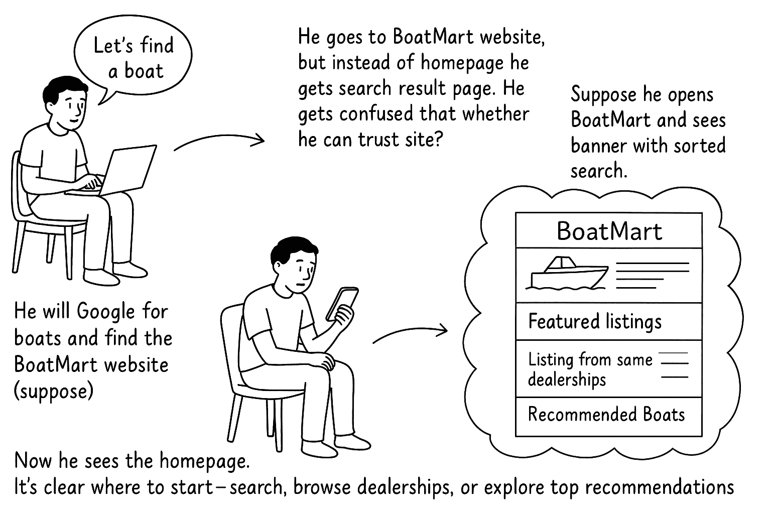
User Journey
I designed this user journey to show, step by step, how a typical user like Alex interacts with the website while deciding
to buy a boat. It highlights the key stages users go through.
User journey with persona to show step by step how users browse, search, view
listings, and decide to buy while using the website.
I designed this user journy to show,
step by step, how a typical user like
Alex interacts with the website while
deciding to buy a boat. It highlights the
key stages users go through.
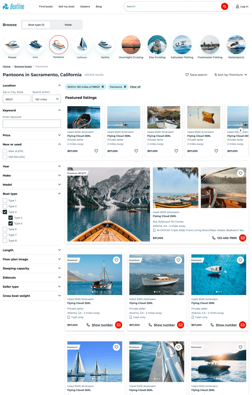
Competetive Analysis
I did competetive analysis to gather some insights, my aim was to identify gaps and opportunities for BoatMart —
particularly around helping users easily trust, browse, search, and select boats with confidence, like how top
competitors streamline their flows.
I did competetive analysis to gather some insights, my aim was to identify
gaps and opportunities for BoatMart — particularly around helping users easily
trust, browse, search, and select boats with confidence, like how top
competitors streamline their flows.
I did competetive analysis to gather some
insights, my aim was to identify gaps and
opportunities for BoatMart —
particularly around helping users easily
trust, browse, search, and select boats
with confidence, like how top
competitors streamline their flows.

Boats
B2B B2C
Competitor

eBay
B2C C2C
Partial Competitor
Findings
It provides a clean homepage with clear categories and featured listings, builds user confidence from the first click.
It listings show verified dealers, detailed specs, photos, and contact details, reinforcing trust.
It has rich filters (boat type, length, price, location), which makes browsing easier.
Findings
Multiple sections (daily deals, sponsored items, trending) crowd the homepage.
Mobile UI more modern and simplified. Product pages show title, images, price, shipping, and seller info.
Badges like Top Rated Seller, eBay Money Back Guarantee, and feedback score are prominently shown.
eBay
B2C C2C
Partial Competitor
Findings
Multiple sections (daily deals, sponsored items, trending) crowd the homepage.
Mobile UI more modern and simplified. Product pages show title, images, price, shipping, and seller info.
Badges like Top Rated Seller, eBay Money Back Guarantee, and feedback score are prominently shown.
What user wants to see?
I used this storyboard to visually communicate to the PM and team how important a proper homepage is in building
trust and guiding users. Instead of overwhelming users with raw search results, a homepage acts as a friendly starting
point, reducing drop-offs and improving engagement.
User journey with persona to show step by step how users browse, search, view
listings, and decide to buy while using the website.
I used this storyboard to visually
communicate to the PM and team
how important a proper homepage is in
building trust and guiding users. Instead
of overwhelming users with raw search
results, a homepage acts as a friendly
starting point, reducing drop-offs and
improving engagement.
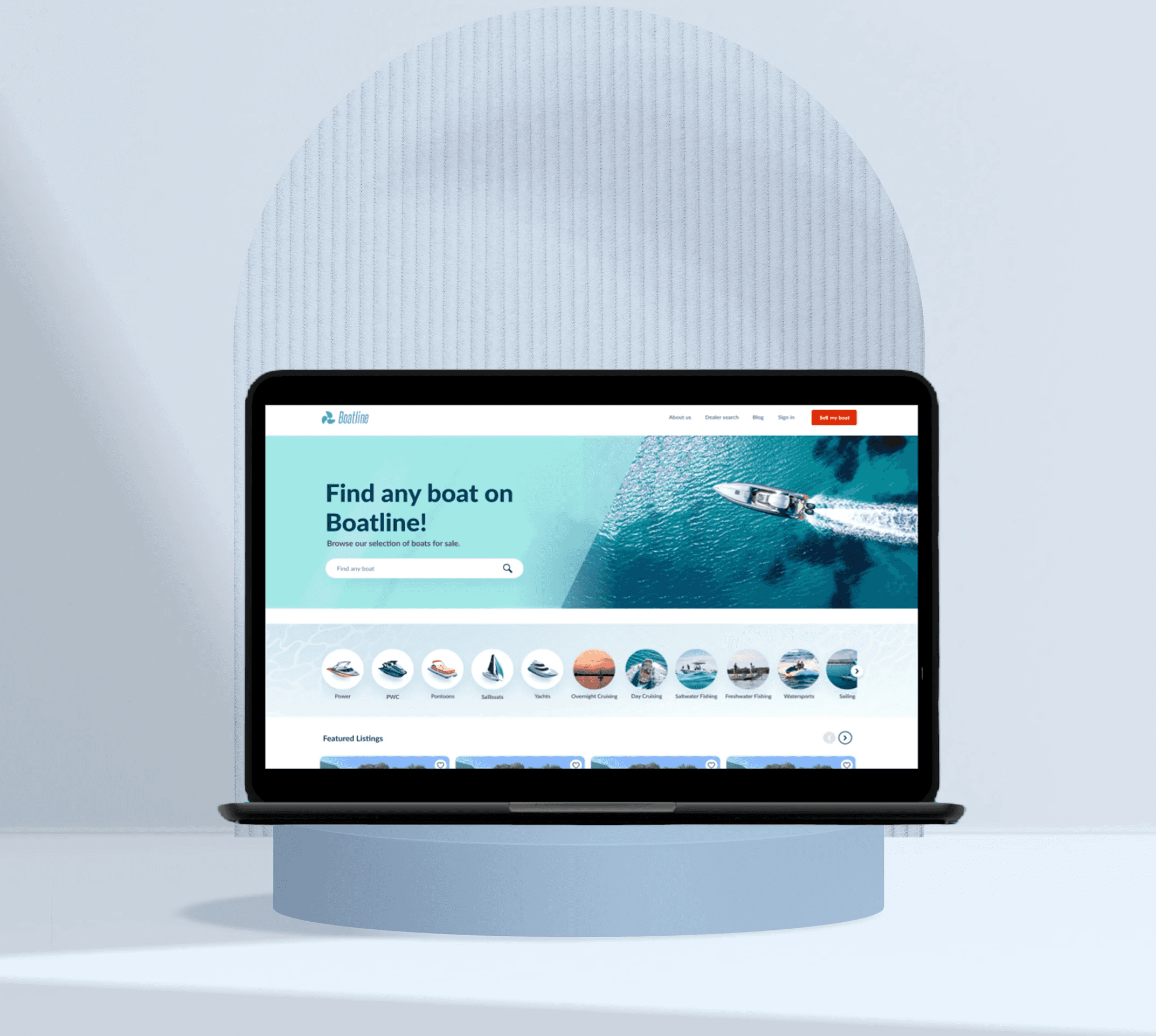
Homepage
With BoatMart, I prioritized a mobile-first approach because user research and market trends indicated that a large
portion of boat buyers and enthusiasts browse listings on their phones. Whether they’re checking boats during a
weekend trip or casually browsing at marinas, their first interaction often happens on mobile.
With BoatMart, I prioritized a mobile-first approach because user research
and market trends indicated that a large portion of boat buyers and enthusiasts
browse listings on their phones. Whether they’re checking boats during a
weekend trip or casually browsing at marinas, their first interaction
often happens on mobile.
With BoatMart, I prioritized a mobile-first
approach because user research and
market trends indicated that a large
portion of boat buyers and enthusiasts
browse listings on their phones. Whether
they’re checking boats during a
weekend trip or casually browsing at
marinas, their first interaction often
happens on mobile.
The banner is like an
inceptive interface of
the website which will
create an engaging and
immersive experience
User who is here
without any clue
what to buy needs
featured listings.
Search bar is now
more prominent,
it’s on the banner
which highlight it
and give the user
better experience.
Search bar is now
more prominent,
it’s on the banner
which highlight it
and give the user
better experience.


The banner is like an
inceptive interface of
the website which will
create an engaging and
immersive experience
User who is here
without any clue
what to buy needs
featured listings.
The banner is like an
inceptive interface of
the website which will
create an engaging and
immersive experience
The banner is like an
inceptive interface of
the website which will
create an engaging and
immersive experience

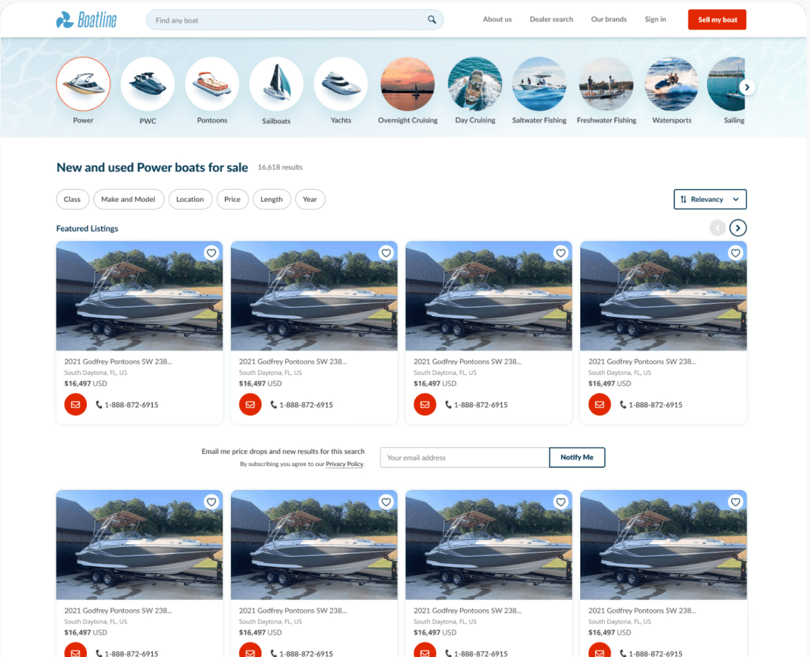
Search Result Page
I designed a collapsible left-hand filter panel on the search results page, aligning with familiar e-commerce
patterns users expect. This makes filtering faster and more intuitive, especially on larger screens, while keeping
the main product grid in focus.
I designed a collapsible left-hand filter panel on the search results page, aligning
with familiar e-commerce patterns users expect. This makes filtering faster and
more intuitive, especially on larger screens, while keeping the main product
grid in focus.
I designed a collapsible left-hand filter
panel on the search results page,
aligning with familiar e-commerce
patterns users expect. This makes
filtering faster and more intuitive,
especially on larger screens,
while keeping the main product
grid in focus.
Introduced a
collapsible
left-hand filter
panel on
the search
results page
Reworked the listing
cards to make them
more engaging and
intuitive.
Streamlined the
subscription section,
which previously
interrupted the
natural browsing flow.
Streamlined the
subscription section,
which previously
interrupted the
natural browsing flow.
Streamlined the
subscription section,
which previously
interrupted the
natural browsing flow.
Globes didn’t
add meaningful
value to the user
journey.
Globes didn’t
add meaningful
value to the user
journey.
Before
Before
After
After
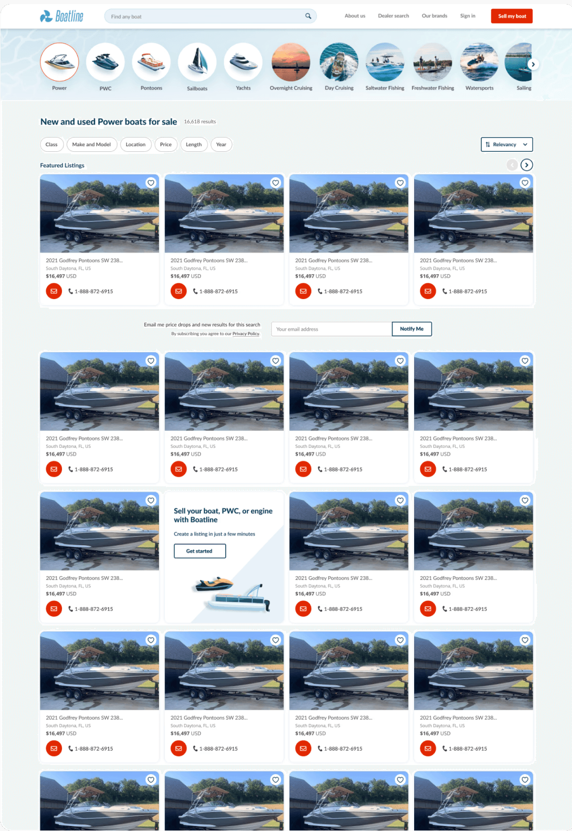
Introduced a collapsible
left-hand filter panel on the
search results page.
Vehical Description Page
The main change I focused here was the email subscription section was scrollable and easily missed by users,
leading to lost opportunities for contact. I restructured this section to be more prominent, ensuring it stays visible
at the right moment without disrupting the user’s flow.
The main change I focused here was the email subscription section was scrollable
and easily missed by users, leading to lost opportunities for contact. I
restructured this section to be more prominent, ensuring it stays visible
at the right moment without disrupting the user’s flow.
The main change I focused here was the
email subscription section was scrollable
and easily missed by users, leading to
lost opportunities for contact.
I restructured this section to be more
prominent, ensuring it stays visible
at the right moment without disrupting
the user’s flow.
The vehicle description
section is scrollable.
No EMI option
was one of the
major concern
of the user.
No EMI option
was one of the major
concern of the user.
No EMI
option
was one
of the
major
concern
of the user.
The email
subscription
section was
scrollable.
Before
After
After
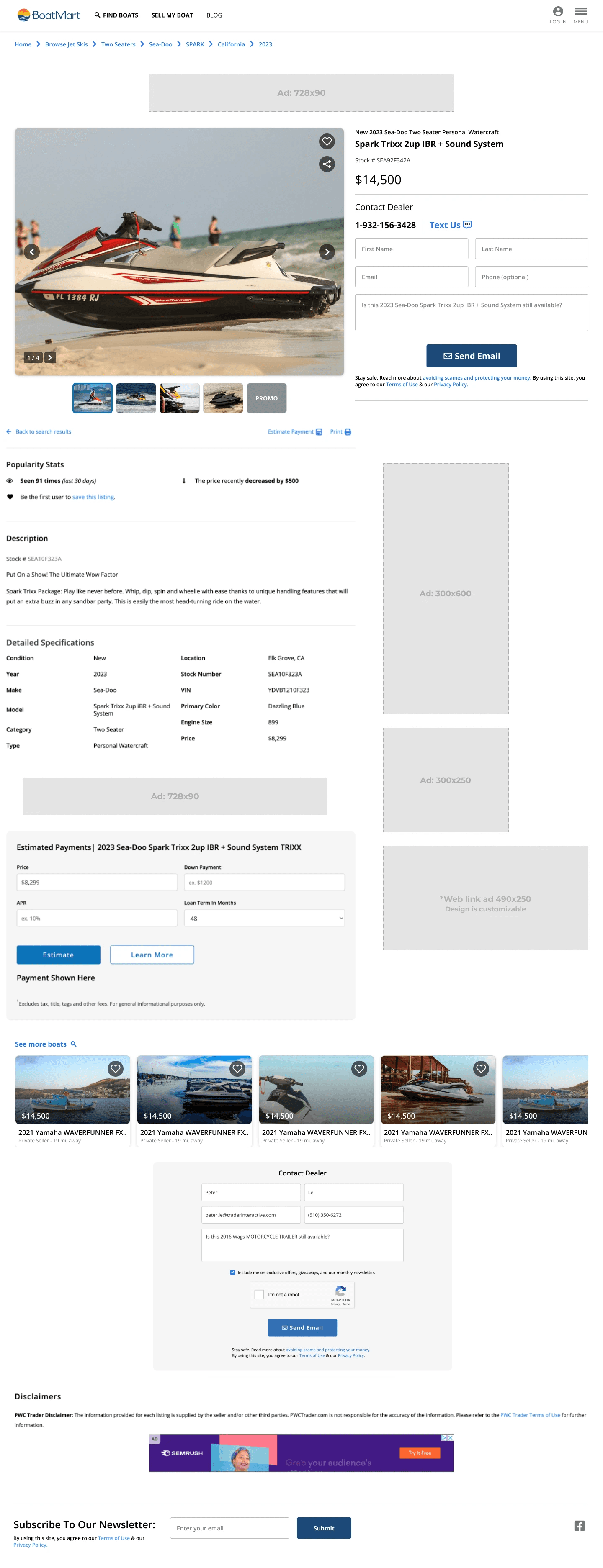

Description of vehicle
is now below the vehicle
images, added EMI section
and "more boat options.
The vehicle
description
section is
scrollable.
Description of
vehicle is now
below the
vehicle images,
added
EMI section
and more
boat options.
Usability Testing
I conducted usability testing sessions with team members and product managers before handing over the final
designs to developers. This collaborative testing helped validate key user flows, surface minor UX issues early,
and align the entire team on design decisions..
I did competetive analysis to gather some insights, my aim was to identify
gaps and opportunities for BoatMart — particularly around helping users easily
trust, browse, search, and select boats with confidence, like how top
competitors streamline their flows.
I did competetive analysis to gather some
insights, my aim was to identify gaps and
opportunities for BoatMart —
particularly around helping users easily
trust, browse, search, and select boats
with confidence, like how top
competitors streamline their flows.
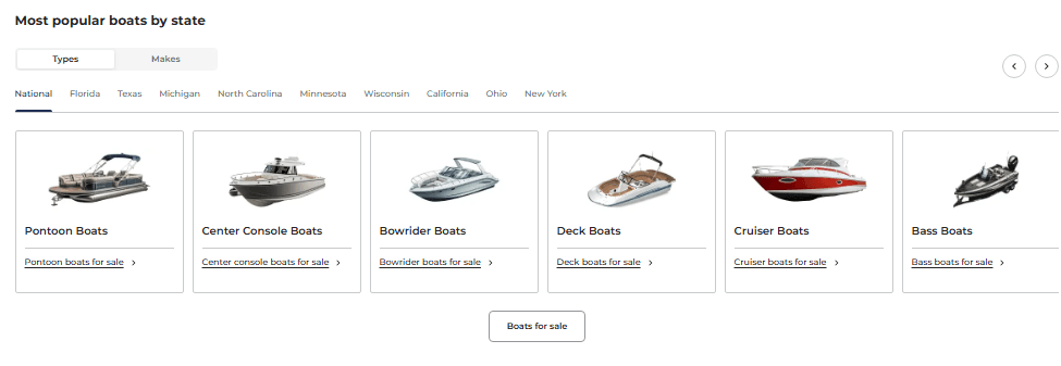
Usability changes
Replaced circles with square images and labels for better alignment and quicker recognition.
Expanded the selection to include more top models, making it easier for users to find what they’re looking for.
Updated the cards with new design system .
Usability changes
Replaced circles with square images and labels for better alignment and quicker recognition.
Expanded the selection to include more top models, making it easier for users to find what they’re looking for.
Updated the cards with new design system .
Usability changes
Replaced circles with square images and labels for better alignment and quicker recognition.
Expanded the selection to include more top models, making it easier for users to find what they’re looking for.
Updated the cards with new design system .

Metrics
I think it worked:)
After launching the redesigned homepage, the conversion rate increased by 25%. This confirmed that simplifying the user journey and improving visual hierarchy directly impacted user engagement and goal completion.
Post-redesign, bounce rates dropped while conversion rates climbed. Users spent more time on site (over 60 seconds), browsed deeper, and engaged by saving boat listings
Engaging with users is key to building loyalty and driving conversions. As user interactions increase, so does revenue — making a seamless, interactive experience essential for business growth.
Key Learnings
User-Centric Design
Understanding:
Redesigning showed me the power of
putting the user first.
Embraced Continuous
Improvement:
This project reinforced that design is an
ongoing process; there's always room to
refine and optimize
Gained Deeper User-Centric Design Understanding:
Building this from scratch helped me see the importance of designing from the user’s perspective
Gained Deeper User-Centric Design Understanding:
Redesigning helped me see the importance of designing from the user’s perspective
Embraced Continuous Improvement:
This project reinforced that design is an ongoing process; there's always room to refine and optimize
Embraced Continuous Improvement:
This project helped me realize design there's always room to refine and optimize
Case 02
25% Increase in Conversion Rate
B2B-B2C